
Pager Connect: iOS
Background:
Microsoft Power BI allows users to take mounds of data and transform them into beautiful interactive visuals and reports. As the Creative Lead for Microsoft Power BI, I was responsible for recruiting, marketing, branding, UX and visual design for all parts of the product. If that sounds like a broad scope of responsibilities—it was! Our design team more than doubled in size in my time at the company and I was proud of our output and the significantly improved collaboration between design and the other disciplines while I was there.
Execution:
We complemented the established Neighborhood Goods brand with an identity inspired by vintage menu design, and typography with mid-century cafe and department store aesthetics. Serious design without taking itself too seriously, we created vibrant menu systems and accompanying collateral.

General Image of Pager Connect Product
Project Overview:
As Atlassian is moving towards Cloud Enterprise, we needed a platform to provide transparency to the end customer admins to manage all of their Atlassian cloud subscriptions, in one place. It was becoming difficult for customer admins who engage with Solution Partners to keep track of an average of 300-500 subscriptions. We identified their top goals and pain points, which vary from a direct customer org and built a platform curated towards an Enterprise needs, easier the communication between them and Solution Partners.
General Image of Pager Connect Product
Problem Statement:
How might we enable customer admins to manage their subscriptions in one place and improve their engagement with Solution Partners?
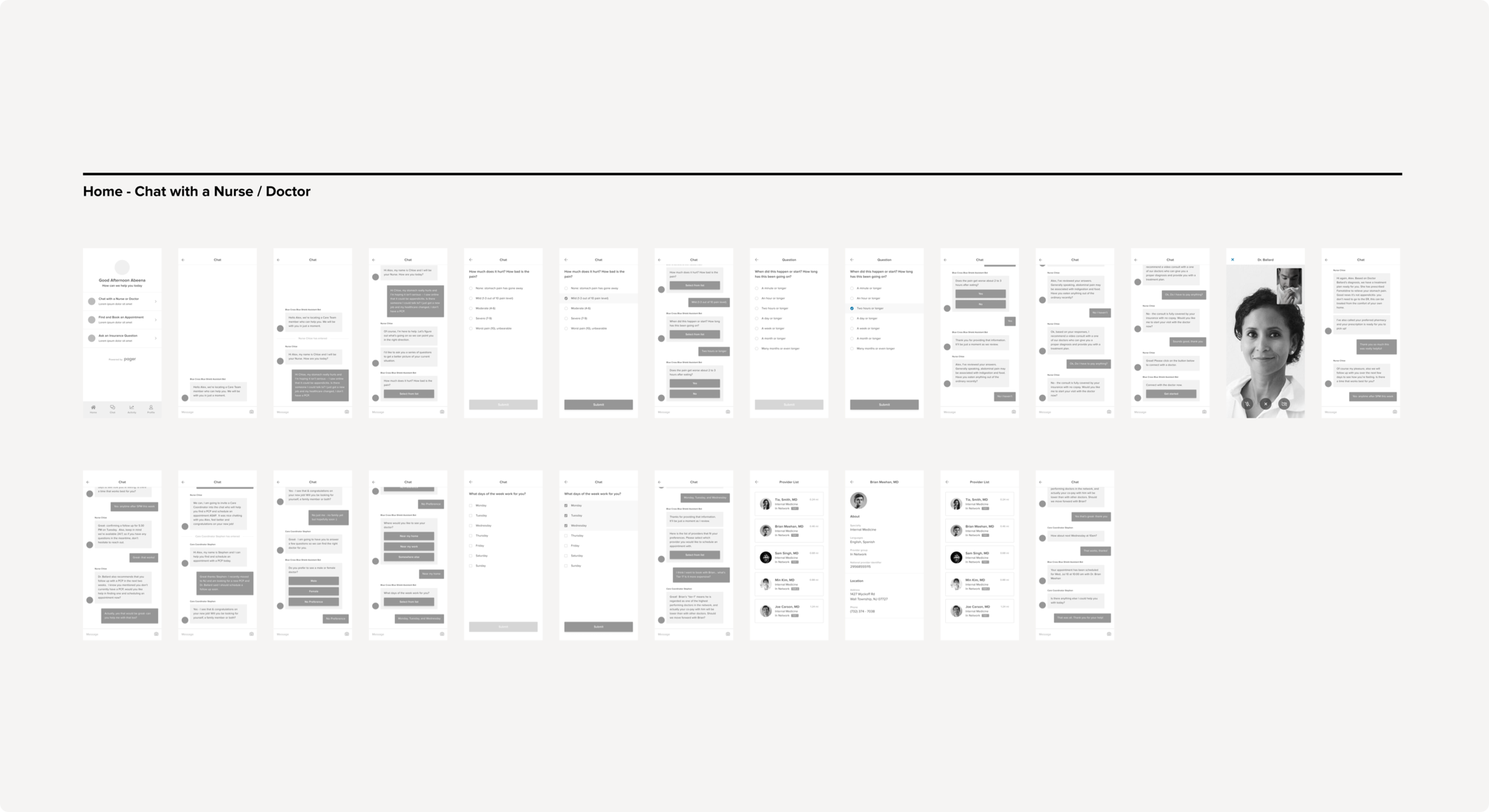
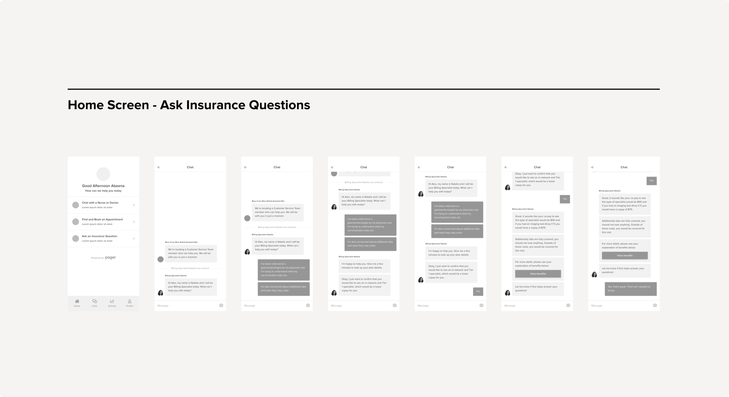
Through initial discovery and early stakeholder interviews, we identified that of that 10% of users that downloaded an insurance provider’s app, users were only utilizing the app to find the customer support line to address billing concerns. Users were also unbeknownst to services such as telemedicine or finding and booking an appointment. Once that task was complete, users would uninstall the app.
Through initial discovery and early stakeholder interviews, we identified that of that 10% of users that downloaded an insurance provider’s app, users were only utilizing the app to find the customer support line to address billing concerns. Users were also unbeknownst to services such as telemedicine or finding and booking an appointment. Once that task was complete, users would uninstall the app.
ApproachWithout direct access to our users, we spoke first with internal stakeholders, then our partners in the Command Center, to understand our users' root problem and core needs. The product goal was to streamline the whole experience in one application to reduce unnecessary time spent. The less time and effort users spend onboarding, the more they could spend receiving the care they need. Our success matrix included time spent on managing orders and reducing overdue orders and unfulfilled orders.
OutcomeThoughts:
Not every job is the kind of place where users will write poems about the features that you build, but Power BI was exactly that type of job. Building tools that help people do their jobs is one of the most satisfying types of work I’ve had the pleasure to take on.
Since the MVP implementation of Opportunity Manager, we’ve seen a significant decrease in the number of pain points plan leaders, analysts, and customer managers and representatives have been experiencing.
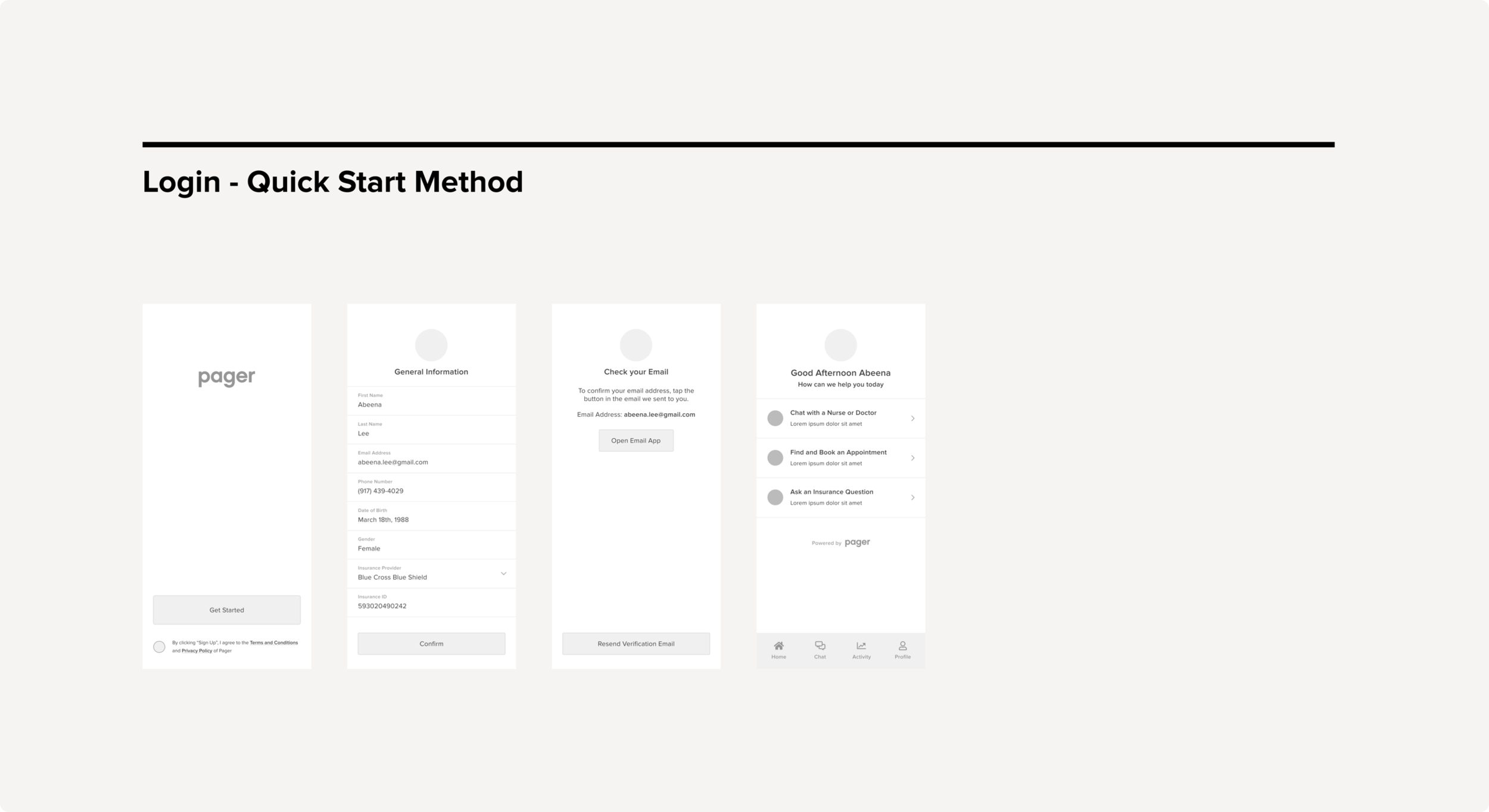
COMPANY:Pager, Design & Product Team — May 2020 to October 2020
Role and Team:Product designer, UI/UX, Frontend, Product illustration. Collaborated closely with Copywriter, Data Analyst, Business Leads, Brand Designers, UX Researchers, Customer Support team.
Research
General Image of Pager Connect Product
Discovery and Research:
We began our process using preliminary research that earlier Pager team members had conducted in order to define the problem. From there we set out to synthesize and validate their findings, and conduct our own research to fill in the gaps.
We had 2 weeks to conduct discovery and research. I first started by interviewing internal stakeholders, then our partners in the Command Center to understand our users' root problem and core needs. These were some our high level findings:
Users were unbeknownst to services such as telemedicine, finding and booking an appointment. — Because of this, our clients (insurance provider) mobile application has poor downloads, low usability, and high uninstall rates.
Pager Connect needed to be the site of care. — We needed to change the end users perception of how the app was viewed
Through initial discovery and early stakeholder interviews, we identified that of that 10% of users that downloaded an insurance provider’s app, users were only utilizing the app to find the customer support line to address billing concerns. Users were also unbeknownst to services such as telemedicine or finding and booking an appointment. Once that task was complete, users would uninstall the app.
General Image of Pager Connect Product
Discovery and Research:
Subject Matter Interviews:
We began our process using preliminary research that earlier Pager team members had conducted in order to define the problem. From there we set out to synthesize and validate their findings, and conduct our own research to fill in the gaps.
We had 2 weeks to conduct discovery and research. I first started by interviewing internal stakeholders, then our partners in the Command Center to understand our users' root problem and core needs. These were some our high level findings:
Users were unbeknownst to services such as telemedicine, finding and booking an appointment. — Because of this, our clients (insurance provider) mobile application has poor downloads, low usability, and high uninstall rates.
Pager Connect needed to be the site of care. — We needed to change the end users perception of how the app was viewed
Through initial discovery and early stakeholder interviews, we identified that of that 10% of users that downloaded an insurance provider’s app, users were only utilizing the app to find the customer support line to address billing concerns. Users were also unbeknownst to services such as telemedicine or finding and booking an appointment. Once that task was complete, users would uninstall the app.
Role:
Design Manager
Design Manager
General Image of Pager Connect Product
With this in mind, design decision making criteria throughout the process was to add requested new key features, keeping things familiar for things that are working well, fixing broken elements, and removing unused features. I made decisions based on data analysis, qualitative research, usability testing, and team discussions.
Subject-Matter InterviewsCOMPETATIVE ANALYSISWe next moved on to conducting an competitive analysis of direct competitors in the telemedicine industry. analyzed 4 direct competitors in the ride-sharing industry (Lyft, Wingz, Didi, Uzurv) and 1 mobile app that serves two-sided market (Wag!). These were some of our high level findings:
A lot of the competitors we’re standalone applications that took
We’re Pager Connect had leverage was that we we’re providing telemedicine serves to
User Journey Map
User journey mapAfter conducting the stakeholder / command center interviews and carrying out the competitive analysis. We then felt it was important to build empathy with users and get familiar with the old tool. Based on past researches findings, I created a user journey map and shared users' pain points and wishlists with the team.
Brainstorming and Ideation
Service Blueprint
SERVICE BLUEPRINTTo help us identify current gaps in the user experience, we created a service design blueprint. Through this exercise, we were able to identify new entry points for the consumer platform for both consumers and team members. In addition, we were also able to identify both front end and back end processes needed to support the platform.

Task Prioritization Matrix
Task prioritization matrixIn our first iteration, when an organizer creates an event, we would automatically default the organizer to set a date for their flyer. If the organizer chooses to add another date, that would create a polling calendar for their guests to vote for the option that works best for everyone.
This version had a minimal and clean UI, but it wasn’t intuitive enough for our organizers. This feature lacked instructions and caused confusion. It was an interesting challenge balancing the interaction, language and typography.
Rapid Prototyping

LOW FIDELITY WIREFRAMESIn our first iteration, when an organizer creates an event, we would automatically default the organizer to set a date for their flyer. If the organizer chooses to add another date, that would create a polling calendar for their guests to vote for the option that works best for everyone.
This version had a minimal and clean UI, but it wasn’t intuitive enough for our organizers. This feature lacked instructions and caused confusion. It was an interesting challenge balancing the interaction, language and typography.
Testing and Validation

User Feedback
User FeedbackI asked 4 participants to test out the prototype's usability. The participant pool was comprised of people between the ages of 18 and 45. The participants were given three different scenarios, each with a task to complete.
Tasks:
Head to John Legend’s Artist Moment, and leave a comment on the video.
View Lady Gaga’s activity in the social feed, and share her music selection to your Instagram Story.
View Kanye’s most recent activity in the Social Feed, and select the option to unfollow him.
In the Social Feed, change the privacy settings of your Britney Spears post to private.
RECOMMENDATIONSDesign Response to Feedback:
Tailor the dashboard experience based off of the user. (This eventually became focused on catering strictly plan leaders and analysts with customer support reps in phase 2)
Create a dedicated “Recent Activity” page in where users can view all the members log ins & outs, health actions, upcoming appointments, customer support chats. (Was de-prioritized to phase 2).
Improve the searching capabilities by introducing shortcuts, members should be able to search by name, member id, or birthdate.
Filtering capabilities should be improved, users should be able to filter members by member id, birthdate, health actions, NPS scores, and more.
Implementation

Visual & Interaction DesignThe use of color, typography was important, we chose to keep the design fairly clean (white, gray, blue, and red occasionally). For example, headers and confirmations were blue, the general text was gray, and delete or cancel confirmation buttons were red.
With Opportunity Manager, the hardest visual and interaction problem we faced was trying to offer a visually simple tool with advanced capabilities to those that were necessarily tech-savvy. Customer support representatives would be our main user base for this product, and while 40% was tech-savvy, the other 60% was not.
VISUAL QAEngineering was involved from the beginning of the design process to the end. We held multiple meetings in where we discussed the requirements of various features before any design began. This gave engineers the opportunity to speak to any technical details that could impact our design decisions.
When an engineering task was completed for a specific feature that initially involved design work. We always held an impromtu visual QA session to talk through the implementation and make sure that it met visual and interaction design standards.
Current Takeaways

Learning & Looking BackBe strict about the following the MVP - This helps deal with out-of-scope requests that could potentially derail the project and helps deliver a quality product in time.
Continue to involve engineering upfront - This helps to reduce any rework later on as an understanding of the technical limitations upfront will help to inform your design strategy.